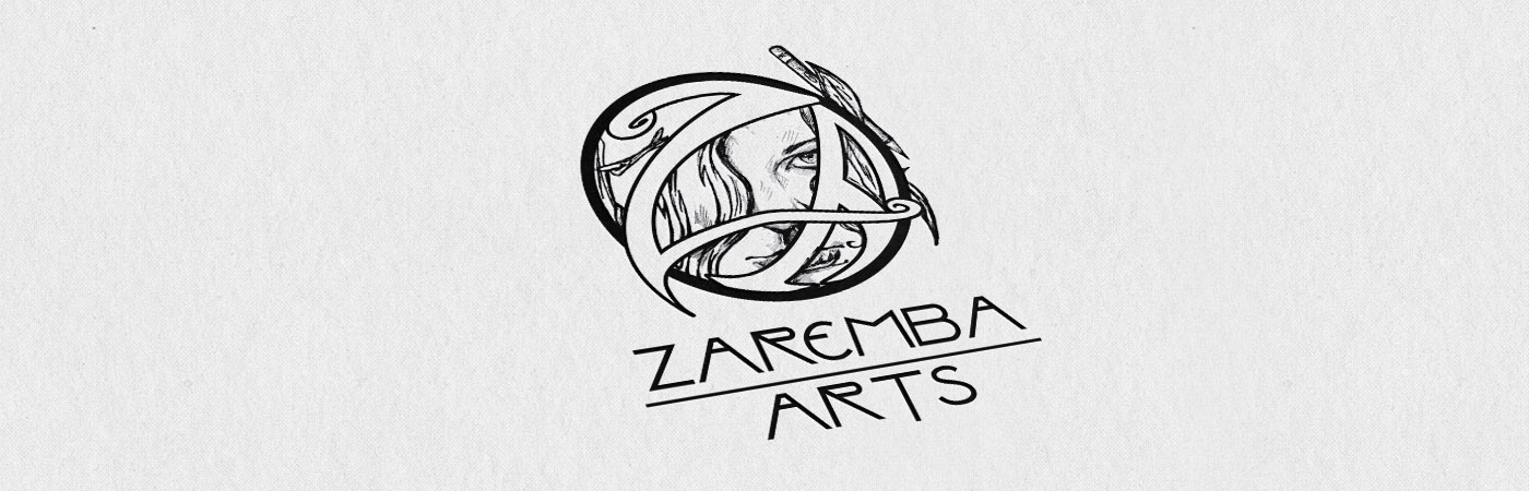
Zaremba Arts
Project Type:
Client:
Tools + Materials:
Overview
Design Dilemma
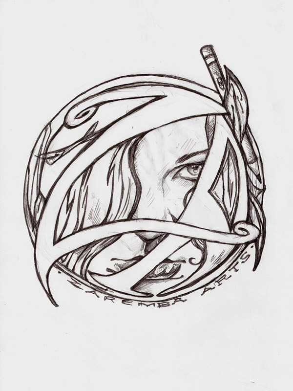
Sabrina Zaremba is a wonderful illustrator and fine artist who had a dilemma. Her original hand-drawn logo was created on ink and paper; while scanning it can resolve some issues, digital media is necessary for use in promotion and watermarking original art, and you can’t watermark or promote with just a simple scan.
Original Concept
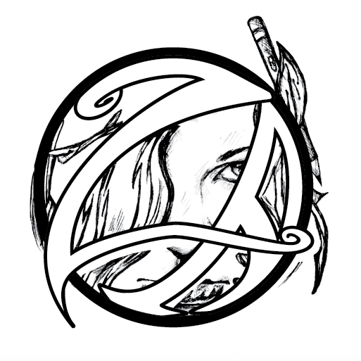
The hand-drawn image, created in pencil and ink, utilizes a combination of a partial self-portrait masked by the initials of the studio, Z and A; interconnected vines and strands of hair wrap around the image and intertwine between both the portrayal of the artist and the studio element – evoking the feel of strong graphic novel-style line work and the artist’s pronounced fondness for the Art Nouveau era.
Look + Feel
A fine art studio, while specializing in various media, should evoke their style whenever possible. Likely the first image many may see, the logo should keep the look and feel of the art created. Soft strokes, hard lines, shading, light gestural marks and dimensional elements abound in the scan of the original drawing. Keeping these elements is imperative for the vector logo’s success.
Strategic Plan
To fully take advantage of the elements presented while creating a successful logo, we decided to split up the pieces of the scanned drawing to create further balance, proper proportion, and contrast, to allow the lines and hatching that make a hand-drawn image as logo so distinctive. Balancing this concept with a strong, bold, and extremely legible font – using the inspiration of Art Nouveau – dictated the steps that must be taken to accomplish this.
Process
Step 1.
We began by pulling the scanned drawing into Adobe® Photoshop in order to jumpstart the editing process. Using a Wacom® Intuous Tablet, we cleaned up the extraneous linework and smudges and smoothed out the image. Adjusting the curves, allowing us to create more contrast for later use in Adobe® Illustrator, enabled us to remove further marks and unnecessary lines. Once the strength, contrast, and smoothness were adjusted, we moved on to the next step.
Step 2.
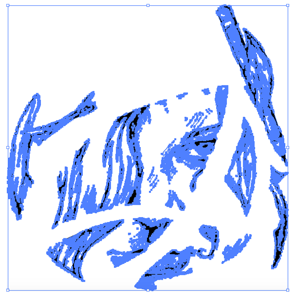
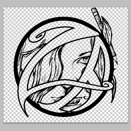
Illustrator enabled us to see the first step from a different view. We began by drawing out the circular areas and then using our tablet to redraw clean lettering where it should end up being placed in the future. Utilizing the vector tools provided, it was quickly established that the circle encapsulated the image like an emblem was not in fact a true circle. Since the circle was not entirely event, the lettering also was off. We used magenta lines to help discern exactly what actions needed to be taken next. Knowing exactly what needed to be removed, so that the logo could work as intended, we took the first iteration of the scan cleanup and went back into Photoshop.
Step 3.
Returning to Photoshop with the Intuous tablet, we further removed all linework associated with the lettering. This enabled us to then draw these portions in later with Illustrator so that no overlap or uneven proportion would occur in the final logo.
Step 4.
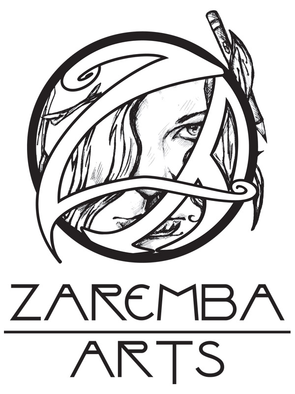
We went back into Illustrator to use the live trace tool set to grayscale in order to pull out the linework that we expanded with curve contrast in Photoshop. This allowed us to keep not only the inked lines but also the pencil stroke shading that we left. When printed, this allows for the same look and feel of the drawing but as it is also a pure vector image, it can be resized infinitely upward to use for any print area without the loss of resolution found in raster images; in using this method we can also avoid having a background image (such as the paper the original scan was forced to keep) so the logo can be placed over anything and keep the clean lines it now functions with.
Step 5.
Since the artwork was drawn by hand (where it’s exceptionally hard to form a true, even circle) there were some discrepancies between the original and the adjusted text and round emblem, we needed to split the traced lines in order to fit them appropriately within the new space. Leaving them in their original form and placement would result in loss of linework in certain areas and would lead to overlap from the new circle and text design.
Step 6.
After breaking apart the linework, and placing it appropriately to avoid misuse of space or disconnected lines, we broke apart the vector lines we created for the circle and text using the divide tool in the Illustrator pathfinder and removed all white areas. We then expanded the lines and united them to form one clean and connected full black area to be used over the linework. This allows for the export of the logo not only as a true vector PDF, EPS, or AI file but also a png in Photoshop with a transparent background so that the logo can be layered over colored areas or used as a watermark.
Step 7.
With the logo artwork complete, the next phase is deciding on a font that not only connects to the image but also reflects the design and provides clear, legible, and easily distinguished copy. We discussed the overall look and feel of the project along with the represented theme, and decided to use an Art Nouveau-inspired font that also met our criteria discussed in the last step. For this, we chose to use four fonts in order to review their efficacy and decide which would be the best choice. After researching and looking for the fonts to use, we selected (from top left to bottom right): Parseltongue, Reynolds Caps, Benjamin Regular, and Valley Grrrl NF. The clear choice was Valley Grrrl NF (bottom right), which we selected to use in the final logo.
Utilization
With the logo complete, we also provided image utilization methods to display versatility. We included window lettering done in one color pressure-sensitive 2 ml. vinyl film (industry standard for lettering directly on glass), printed branding pieces such as a digital media album and printed folder for art deliverables, along with a double-sided business card.
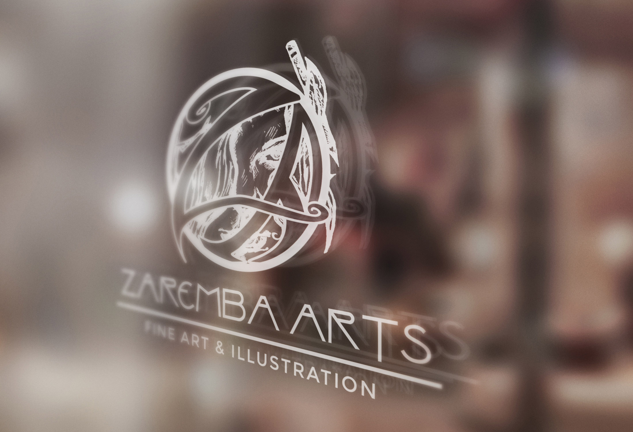
Window Lettering
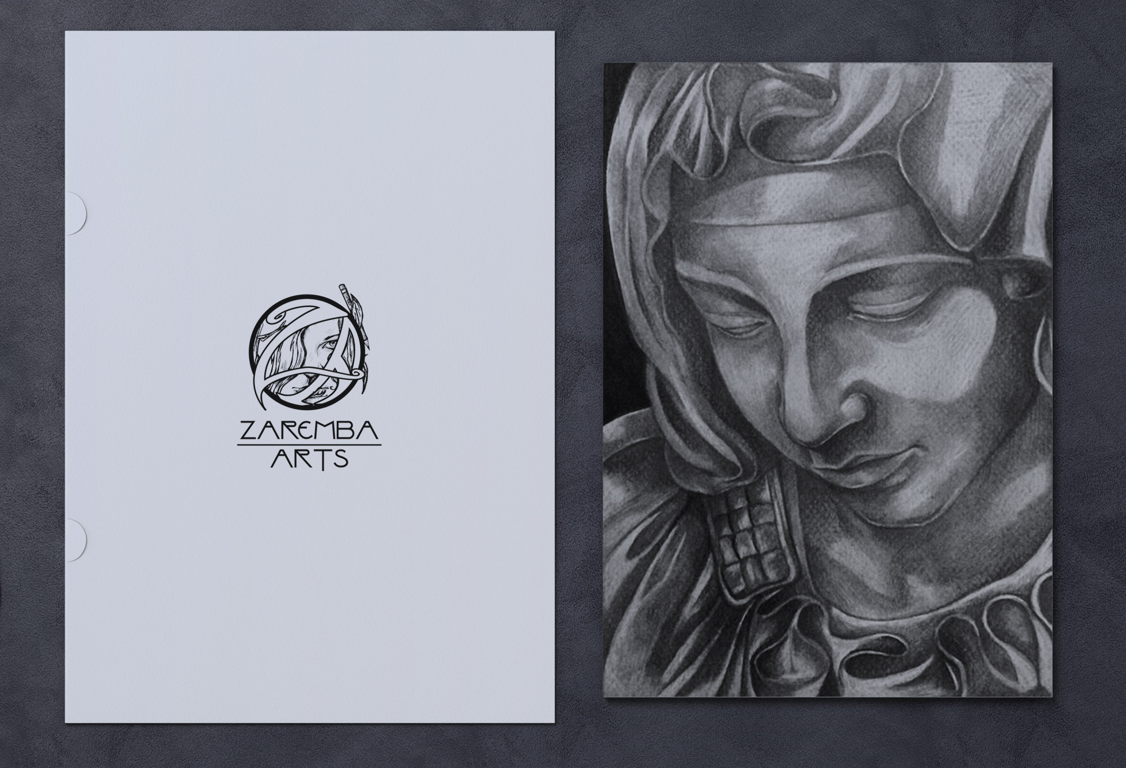
Media Folder

Business Card
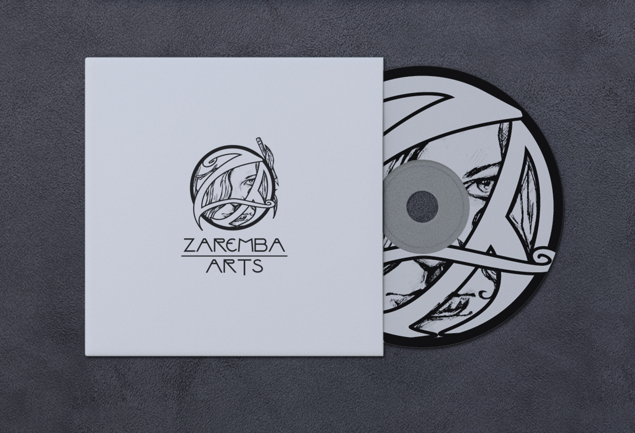
Digital Media
Results
The Zaremba Arts logo functions under the four founding principles of Avant Creative’s mission: relevant, enduring, versatile, and distinctive. With several variations of the logo for use with horizontal and vertical spaces, a stand-alone singular image without text, and developed with web, print, facade, and mobile in mind, the logo is a successful redesign of an original drawing, meeting our client’s needs and vision.
“The original concept I wanted was an Art Nouveau feel. Being hand drawn, I didn’t really meet the aesthetic I was aiming for. The digital execution streamlined my original source material, refining it to a more aesthetically pleasing and commercially viable image. I am pleased with the outcome because it fully incorporates my original vision while adding elements that enrich the image – keeping with its spirit of the Art Nouveau aesthetic.”